📚

Most common birthdays in Switzerland, visualised

August 25, 2013

Once you’ve started getting into programming, there are always new mountains to climb. After learning the basics, my next goal is to be able to make decent use of D3.js, the de facto gold standard for data visualisations.

We’ve used it for our visualisation of migrants’ remittances, but that time around, it wasn’t me who had to write to code.

Well, it’s a long shot to that kind of D3 visualisation, but the nice thing about D3 is that you can start small and still build visualisations that work well (a bit of knowledge in Javascript and CSS help a lot, but I guess it’s possible without as well, I recommend Scott Murray’s D3 tutorials).

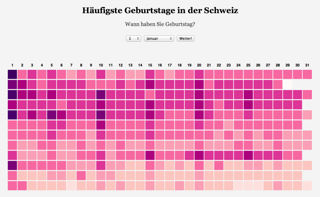
So here’s my first visualisation built in D3. It shows you the most common birthdays in Switzerland and how they spread over the year. I’ve also added a little Javascript tool that allows you to enter your own birthday and see how many others you share it with and how it compares to other dates.

I’ve open sourced the code, so if you want to use it for your own project, go ahead. Also, if you know your ways around D3, please have a look and tell me how I can improve the code.

Hello, nice to meet you. I'm David Bauer. I’m a journalist by training, a product person by conviction, and a generalist at heart. I love complex issues and helping people navigate them. Learn more →

📨 hello@davidbauer.ch 🤝 LinkedIn

Weekly Filet newsletter logo

Make sense of what’s happening, and imagine what could be. My newsletter for nerds and changemakers who love when something makes them go «Huh, I never thought of it this way!». Trusted by thousands around the world, since 2011.

Past work

I have worked for startups and large companies.
As a journalist, strategist, product lead.

I have written stories and strategies.
I have built products and teams.

I have hired, mentored and promoted people.
I have navigated and accelerated transformation.
Pushed for and nurtured culture change.

I have wrangled data and code.
For insights and data visualisations.
Even a series of games.

And a ton of other things that got me excited.

If there’s one thing that runs through it all,
it’s my love for connecting dots and trying new things.

🤝
Neue Zürcher Zeitung, The Guardian, Quartz, Republik, Refind, Livingdocs, Radio Free Europe, Der Spiegel, Das Magazin, Tages-Anzeiger, SonntagsZeitung, TagesWoche, Schweizerische Depeschenagentur, Echtzeit Verlag, MAZ Journalistenschule, TEDxZurich, Bluewin, and some more.

You Don't Know Africa
Challenge Accepted by Republik
Why newsrooms need storytelling tools and what we've learnt building them
Klimalabor at Republik
78s – bessere Musik
A story of drinkers, genocide and unborn girls
E-Mail-Kurs: In der Klimakrise einen Unterschied machen
You Still Don't Know Africa
How to Be(come) a Happy Newsletter Writer
You Don't Know African Flags
The simple tool we use to decide what stories to work on at NZZ Visuals
Bookshelf
36 Fragen für ein gutes Gespräch über die Klimakrise
Wenn Männer über Männer reden, reden Männer Männern nach
Hashtag #rotblaulive
Wie die Republik zu künstlicher Intelligenz steht
Start the timer and try to stop it at exactly one minute!
Vaxillology
Kurzbefehl - Der Kompass für das digitale Leben
To compete with the web's giants, news organisations need to become better at sending people away
Erste Male
How I Learnt to Code in One Year
You deserve a smarter reading list — we are building it
Zum Pi-Tag: Von 3,14159 bis zum derzeitigen Ende von Pi
Milliarden aus der Fremde
Dystopia Tracker
Midterms Results Overview
Euro-Orakel
Dichtestressomat
Wie gut können Sie die Schweiz aus dem Gedächtnis zeichnen?
The End of Journalism in the Digital Age
Vertrauensserie
Lionel Messi's efficiency: he runs fewer meters than any other forward in the Champions League [OC]
60 Stunden Facebook
Work at the Guardian Data Blog