Why does no news site think big?
April 30, 2013 (updated on March 6, 2014)
Apparently, 2013 is the Year of Responsive Design. By the end of the year, everyone and your mother will have a responsive site.
But here’s a thing about responsive design: Everyone seems to assume that responsive is all about making your site work well on small screens. Sure enough, that’s important. Yet there’s no particular reason for your site to stop being responsive once it has grown to 1024 or so pixels wide. Look around your office and you’re very likely to see a lot of screens that are a lot wider.
It struck me when I looked at Quartz’ most recent redesign (which, make no mistake, is yet another great iteration of an already great site). On my 27″ iMac, the site looks like this.

So I set out to check other major news sites across the globe. Not all of them are responsive in the first place, I know, but you’ll get the picture. Here’s what I found (spoiler: a lot of whitespace).
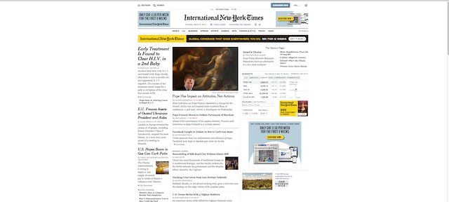
The New York Times
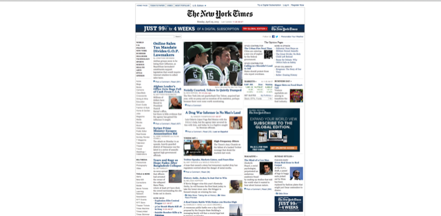
after their 2014 redesign:
The Washington Post

TIME

CNN

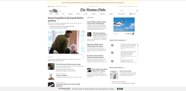
The Boston Globe
The Financial Times

The Wall Street Journal

The Guardian

after their redesign (currently in alpha):

BBC

The Daily Mail

The Huffington Post

ZEIT Online

Spiegel Online

BILD.de

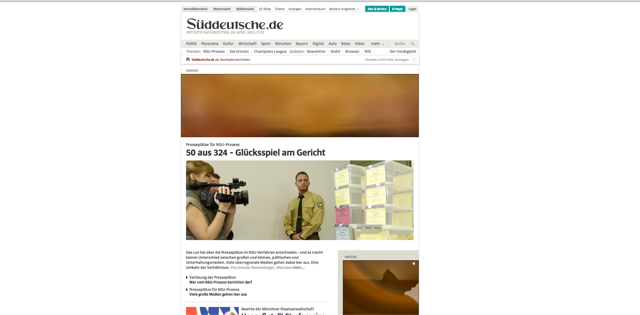
Süddeutsche.de
tagesschau.de (which became responsive just yesterday)

Buzzfeed

The Verge

Mashable

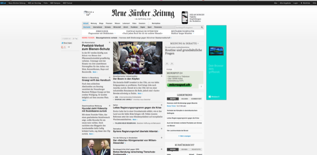
Neue Zürcher Zeitung
20Minuten

Tages-Anzeiger

Blick.ch

SRF

Last, but not least: The site I’m responsible for: TagesWoche

Now, let’s look a little further.
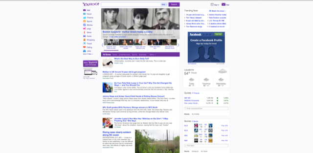
Yahoo

Google News (oh!)

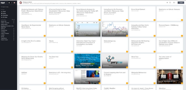
Finally, two examples of sites that are responsive all the way up.
Kippt
And of course: Pinterest

Looking at this wide array of not so wide websites leaves me wondering: Is the ideal size of a news website really around 1024-1200 pixels even when the screen is a lot bigger (or do we like it that way because, at this width, it resembles a newspaper)?
I’m curious to hear your thoughts on this and I for one would love to see examples of actual news sites (I count Google News as an exception here) that try to make use of the full width. Good news that the people at Quartz already have something up their sleeves. This is their Product Engineering Director after I have pointed out the vast unused space on their site:
@davidbauer @zseward Don’t worry – in a few weeks we’ll have put that area to good use
— michael (@donohoe) April 29, 2013
Update: As pointed out by Christoph Widauer, USA Today has a big screen mode that can be activated on click.


 a Happy Newsletter Writer")


![Lionel Messi's efficiency: he runs fewer meters than any other forward in the Champions League [OC]](https://www.davidbauer.ch/wp-content/themes/db25/_/img/portfolio/messi.webp "Lionel Messi's efficiency: he runs fewer meters than any other forward in the Champions League [OC]")

