Data Journalism in Switzerland: The Spaceship Has Landed
March 13, 2011 (updated on March 13, 2015)
It’s about half a year ago that I thought to myself something needed to be done about data journalism in Switzerland. While this branch of journalism is getting increasingly important, with The Guardian, The New York Times and others demonstrating how powerful it can be almost every day, Switzerland has been pretty apathetic about it. So what do you do? You try to learn from the best and find other journalists in Switzerland, eager to come along. That’s when I contacted Simon Rogers, head of the data team at the Guardian, to come to Switzerland for a workshop.
That workshop took place yesterday and it certainly lived up to my hopes of being a sort of kick-starting moment for data journalism in Switzerland. Simon Rogers did a great job showing that data journalism is no rocket science and providing us participants with the knowledge and tools that are needed to get serious about data journalism.
I’ll try to give a brief summary of what Simon Rogers taught us about data journalism, hoping that the fascination will spread well beyond the workshop.
Key Facts
- The average reading time of a data page on the Guardian website is 6 minutes, compared to 1 minute overall average.
- People tend to prefer simple visualisations they can interact with to more sophisticated, custom designed visualisations that communicate one-way.
- Some data stories receive up to 50% of their traffic via Twitter.
- The Guardian is already moving forward from being a mere interpreter of data to a trusted provider of data, too, see World Government Data.
- Crowdsourcing data analysis, like in the Guardian’s now-famous investigation of MP’s expenses, works best if people are given specific tasks, rather than opting for a “here’s all the data, do something with it”-approach.
- Up until September 2010, the Guardian data team was Simon Rogers. Now, it’s him plus two researchers mainly responsible for cleaning and structuring data so they become usable.
Key Quotes
Data Journalism is about using data to make a point.
I’m not a techie, not even a statistician. It’s all about telling stories, using data to do so.
Anything can be data. There is no story that could not profit from data.
Today, we have to publish data so that people believe us. Data are our proof that we’re not making things up.
Our goal is to make data as open and as easily accessible as possible.
When we received the Afghanistan War Logs from Wikileaks, we had our brilliant team of reporters with great knowledge on Afghanistan, wars in general and foreign policy. But none of them had ever used a spreadsheet.
Data Journalism at the Guardian
- The Guardian Data Store: Where all things data come together
- The Guardian Data Blog: All new data stories plus meta-info on data journalism
- World Government Data: A Guardian-curated database of data provided by governments around the world
- Global Development Data: A Guardian-curated database of data on global development
- Developer Blog: A behind-the-scenes view for those interested in the technology
- Data Store Flickr Group: A place where everyone can post their own visualisations
- @datastore: Guardian Data Store on Twitter
- @smfrogers: Simon Rogers on Twitter
Data Processing and Visualisation Tools
- MS Excel or similar: Probably the most important tool to clean and structure your data before ingesting it to other tools. Important actions and fuctions include: Delete empty rows and columns, unmerge cells, merge tables using vlookup(), clean cells using trim(), automatic filters, apply functions to various cells, pivot tables.
- Google Spreadsheets for data storage (and sharing with the public) and simple visualisations.
- Google Fusion Tables: Very simple yet powerful database tool to create visualisations that can then be embedded to any website.
- IBM Many Eyes: Upload your data, choose from pre-configured visualisations, done.
- Wordle to create word clouds from text. It’s a bit overused for visualisations, but can be helpful for research only, too.
- Scribd to publish original documents.
- BBC Dimensions to visualise the scope of big events, recent and historical.
- Impure, a visual programming language aimed to gather, process and visualise information.
- Tableau Public, other visualisation software (Windows only)
- Google Refine: A very powerful, but not so simple tool to clean messy data.
- For more links, check Simon Roger’s Delicious Page on the workshop.
Outcomes
- Matthias Daum has registered the domain datenblog.ch no less than half an hour after the workshop had finished. I guess he’s up to something.
- Die Wahlkampfwolken der Parteien (Manfred Messmer, Arlesheim Reloaded)
- Abt. Verpfändet. Heute: Basel-Stadt. (Patrik Tschudin, Infamy)
- Patrik Tschudin has launched Slit.ch (“we cut open reality with data”). I guess he’s up to something, too…
- More to come.
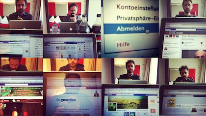
The Ultimate Meta-Visualisation of the Workshop
(there used to be a visualisation of all workshop participants here – sadly, it no longer works)
